DAT
BRANDING / EDITORIAL
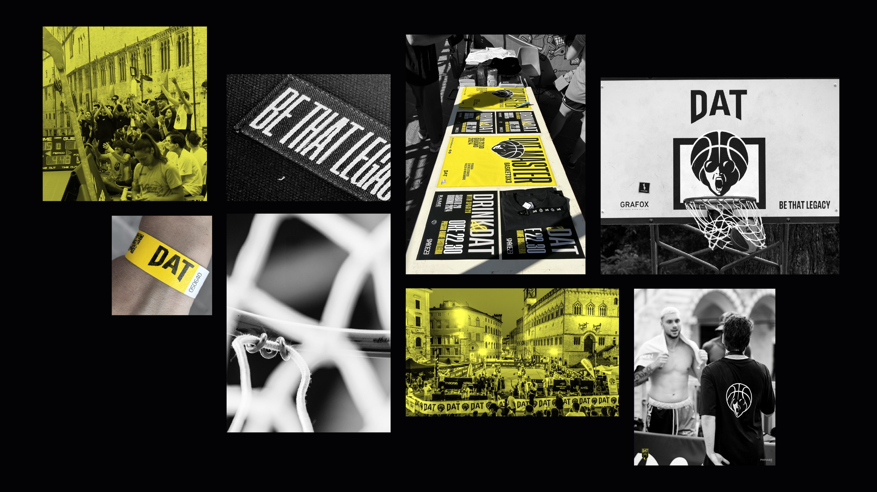
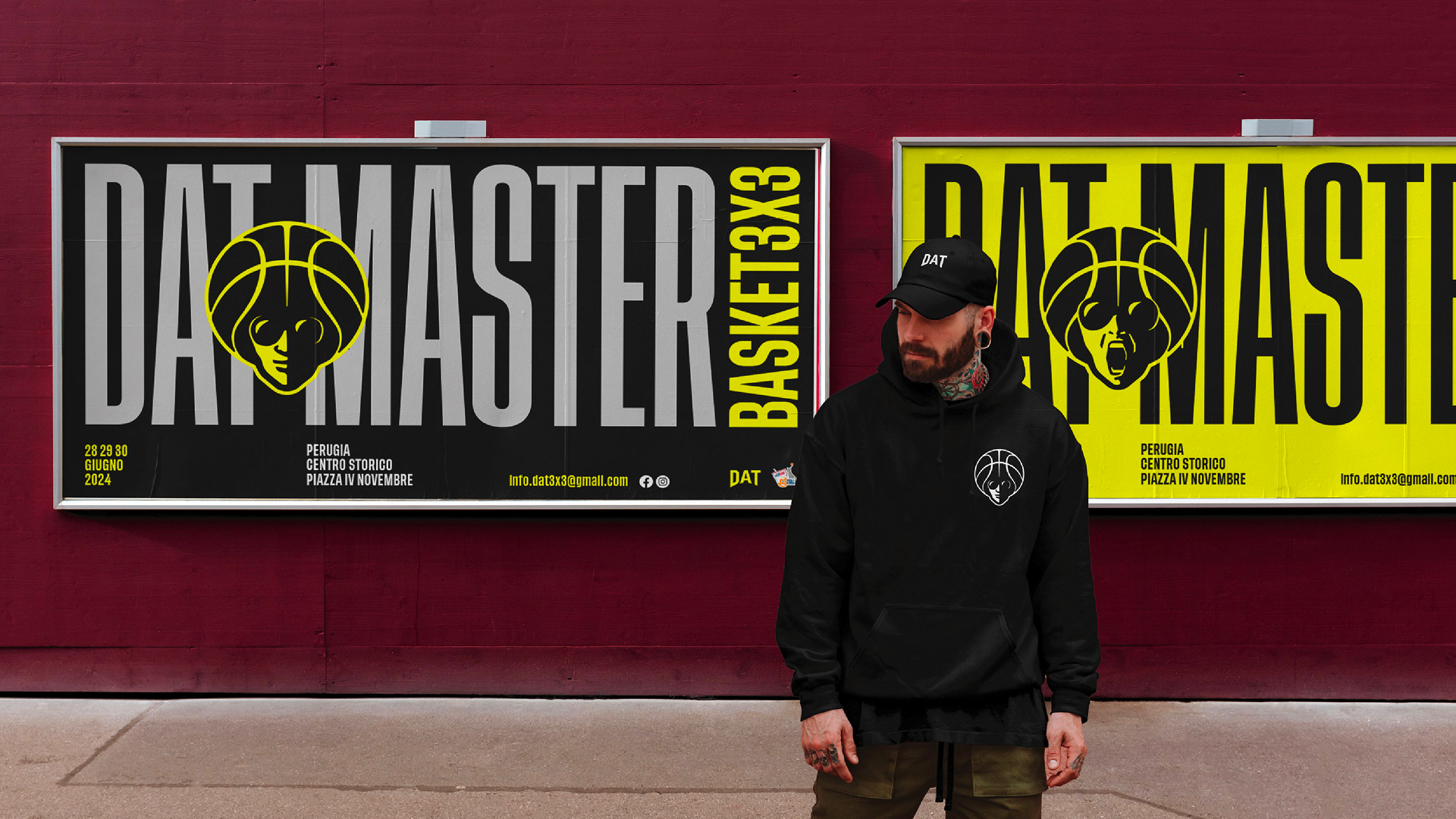
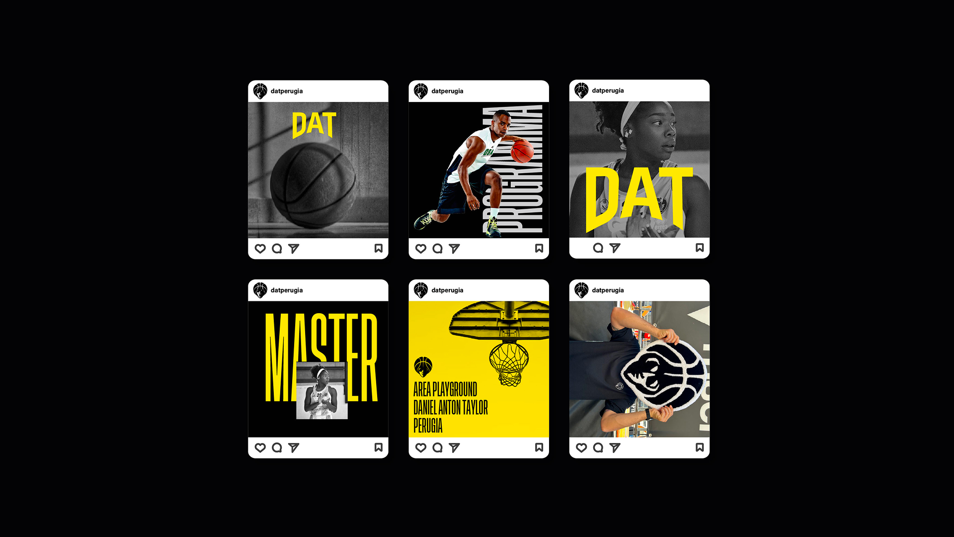
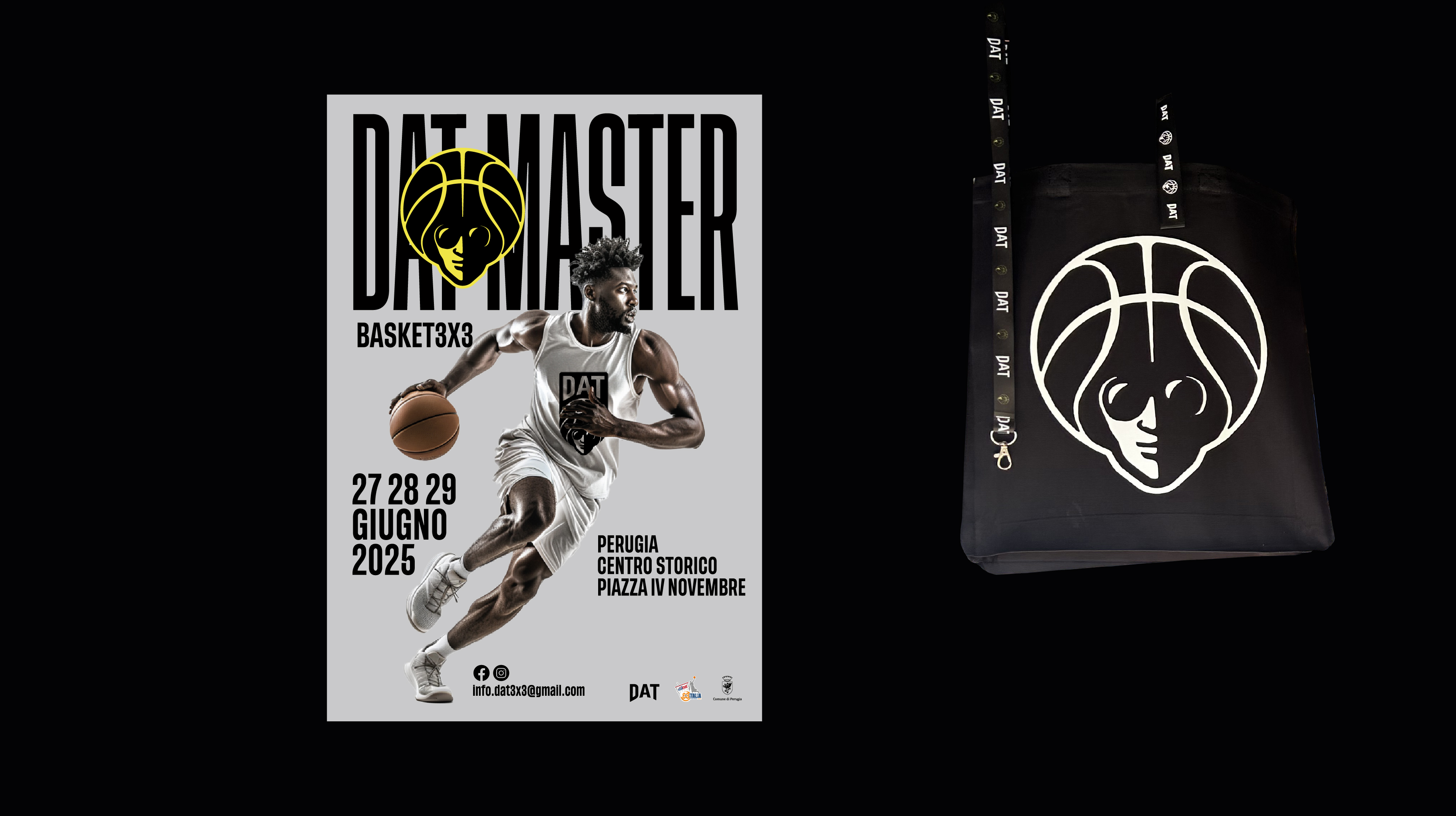
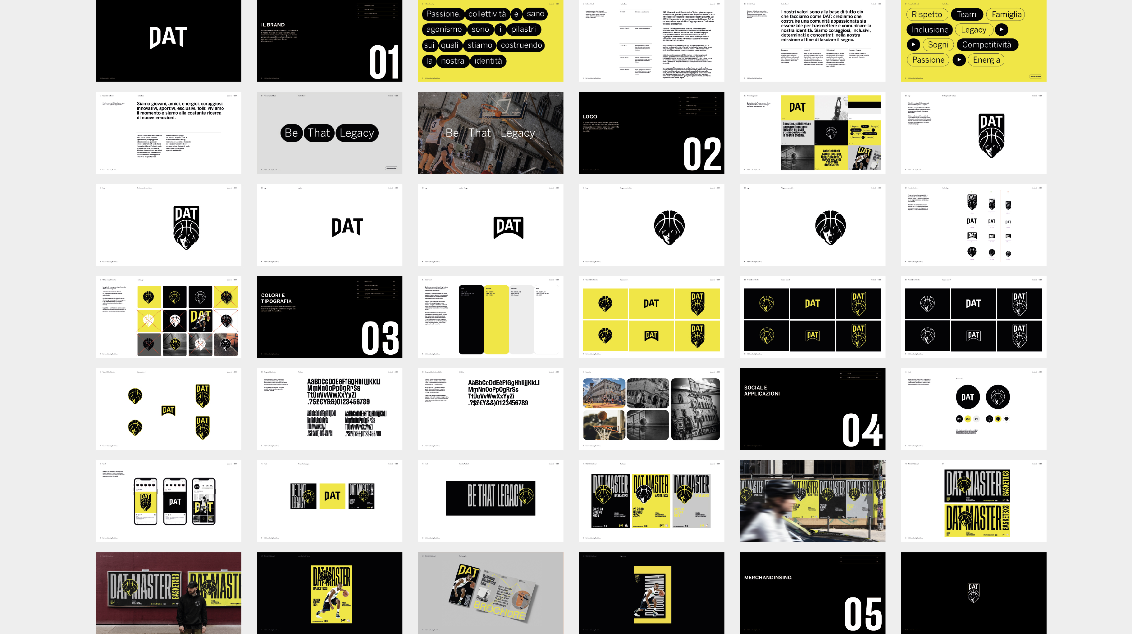
The rebranding project for DAT (Daniel Anton Taylor) was created to express the authentic values of an association that, through 3x3 basketball, promotes community, inclusion, and fair competition. The visual identity is designed to reflect the energy and sense of togetherness that define the tournament: a community united by passion and by the desire to make a positive impact on the territory. The logo’s pictogram portrays the face of Daniel Anton Taylor, the person to whom the tournament is dedicated, becoming a symbol of memory, inspiration, and belonging. The result is a dynamic and contemporary graphic system, capable of communicating the founding principles of the association and making its commitment recognizable both on and off the court.